 Auf Merkliste setzen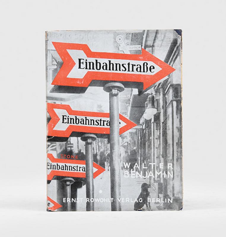
BENJAMIN, Walter.
Einbahnstrasse. Berlin: Ernst Rowohlt, 1928. ¶ Octavo. Original photomontage wrappers with flaps over blue card, printed in red, white, and black. Housed in custom black quarter morocco chemise with grey board sides, and grey board slipcase, by Devauchelle. Wrappers bright, a couple of shallow chips to edges, small puncture to rear wrapper, front joint and front flap fold partially split, brown spot to fore edge. A very good copy of this fragile publication. ¶ Scarce first edition of the philosopher’s literary reflections, his only non-academic work that he lived to see published. “In its typeface and format - a photomontage by Sasha Stone adorns the cover - as well as in its fragmentary style, it is demonstrably one of the most significant products of the German language avant-garde in the 1920s” (Witte, p. 91). This work denounces the “pretentious, universal gesture of the book” to champion the immediacy of language in flitting fragments of text - street signs, leaflets, brochures, articles, and placards. The medium of Einbahnstrasse reflects this message: the typography and layout are inspired by Bauhaus and constructivist aesthetics, while the street-scene cover design has become the most famous work of the Russian-born photographer Sasha Stone. Since writing his postdoctoral work The Origin of German Tragic Drama in 1925, Benjamin had became a prominent cultural critic and “a prolific book-reviewer, travel-reporter, and radio-scriptwriter, forsaking his more esoteric diction for an often disconcertingly concrete language, metaphysical for more topical terrains” (publisher’s note, 1997, p. 33). “The pivotal position of One-Way Street within Benjamin’s work, however, is not due only to its compact register of the sudden mutation in his critical, aesthetic, and political opinions in the mid-twenties. It above all lies in the fact that in the same swift movement with which Benjamin passed from the banks of tradition to those of the avant-garde, he also discovered the heuristic method that was to be peculiarly his thereafter - ‘the attempt to establish,’ as he would later write, ‘the image of history even in its most inconspicuous fixtures of existence, its rejects’. The kaleidoscope of urban objects, warnings, buildings, amusements, signs was designed to throw sudden light on the modern epoch” (publisher’s note, 1997, p. 35). The one-way street Benjamin leads the reader through acts as a panorama of 1920s Germany, terminating at the planetarium, “a space from which to look up - whether to the heavens or the cosmos - and recall what we cannot see” (Wallace, p. 284). Among this montage’s flashes of essays are “Fire Alarm”, "Imperial Panorama", “Monument to a Warrior”, and “Principles of the Weighty Tome, or How to Write Fat Books”. This copy is from the significant collection of Pierre Bergé (1930-2017), the co-founder of Yves Saint Laurent, with his book label loosely inserted. ¶ “Publisher’s Note”, One-Way Street, and Other Writings, 1997; Jack Wallace, “Book Review”, Quarterly Journal of Speech, Vol. 101, No. 1, February 2015; Bernd Witte, Walter Benjamin: An Intellectual Biography, 1991.
Sachgebiete: Deutschland, Literaturwissenschaft, Literatur ab ca. 1900, Philosophie
15000,- EUR
Differenzbesteuert/Subject to margin taxation
Auf Merkliste setzen 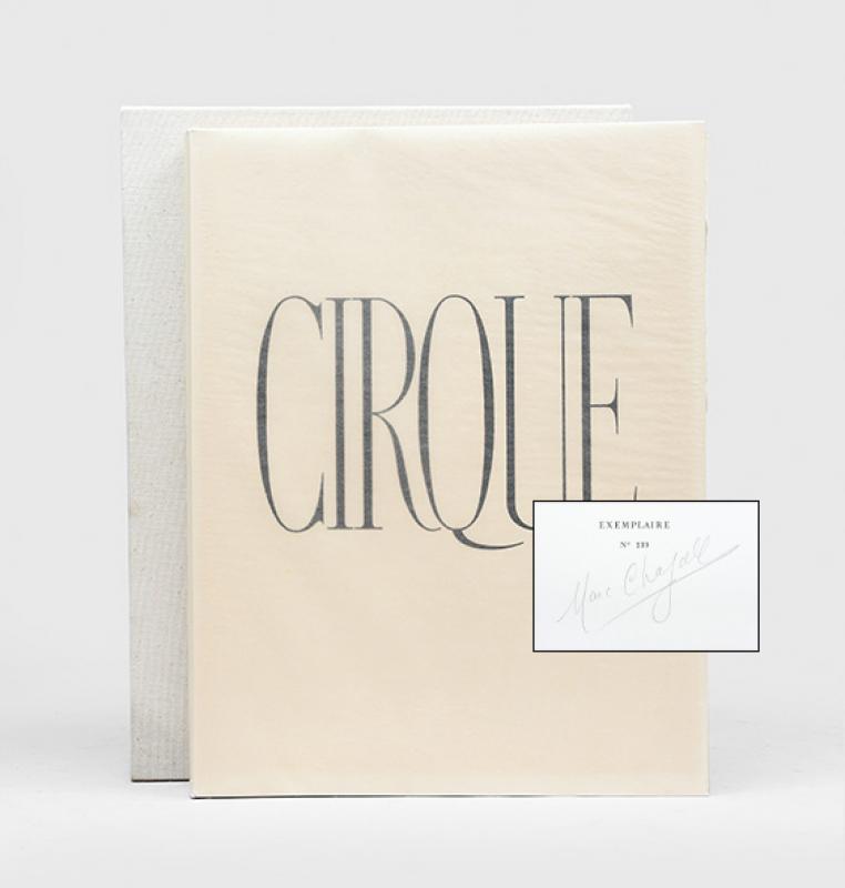
CHAGALL, Marc.v
Cirque. Paris: Tériade Éditeur, 1967. ¶ Folio. Complete with 38 original lithographs, including 23 in colours on vélin d’Arches paper, 3 double page. Sheet sizes: 42.5 x 32.5 cm or 42.5 x 65 cm. Text in French. Original cream wrappers covered in glassine, lettering to front cover in black, sheets loose as issued. All housed in the original cream cloth chemise with slipcase, lettering to spine gilt and further housed in a dark blue flat-back cloth box by the Chelsea Bindery. A couple of light marks to the slipcase, otherwise a fine copy. ¶ First edition, number 239 of 250 copies signed by the artist; a complete copy of one of the most beautiful illustrated books of the late 20th century. The spectacle of the circus was central to Chagall’s personal mythology. “A circus is disturbing. It is profound”, he wrote. “A timeless dancing game where tears and smiles, the play of arms and legs take the form of a great art” (quoted in Baal-Teshuva). Chagall first produced a suite of circus artworks at the behest of his publisher, Ambroise Vollard, himself a great aficionado of the circus. Vollard offered Chagall the use of his personal box at the Cirque d’Hiver in Paris and Chagall was “childishly delighted” with the experience. “The distortions, the violations of normalcy, the clowns... the equilibrists, flying angels, pathetic monsters - all these creatures seemed to have crept out of Chagall’s pictures into the ring. They were naturally Chagallian” (Sidney, p. 292). The 19 gouaches produced for Vollard formed the basis of Cirque, a masterpiece of colour lithography with text written by Chagall, published by Efstratios Eleftheriades, one of Paris’s premier tastemakers. “These clowns, bareback riders and acrobats have themselves at home in my visions”, reminisced Chagall. “Why? Why am I so touched by their make-up and their grimaces? With them I can move toward new horizons. Lured by their colours and make-up, I can dream of painting new psychic distortions” (quoted in Baal-Teshuva). ¶ Cramer Books 68; Mourlot 490-527. Alexander Sidney, Marc Chagall: a Biography, 1978; J. Baal-Teshuva, ed., Chagall: A Retrospective, 1995.
Sachgebiete: Handzeichnungen, Expressionismus, Illustrierte Bücher, Moderne Kunst
210000,- EUR
Differenzbesteuert/Subject to margin taxation
Auf Merkliste setzen 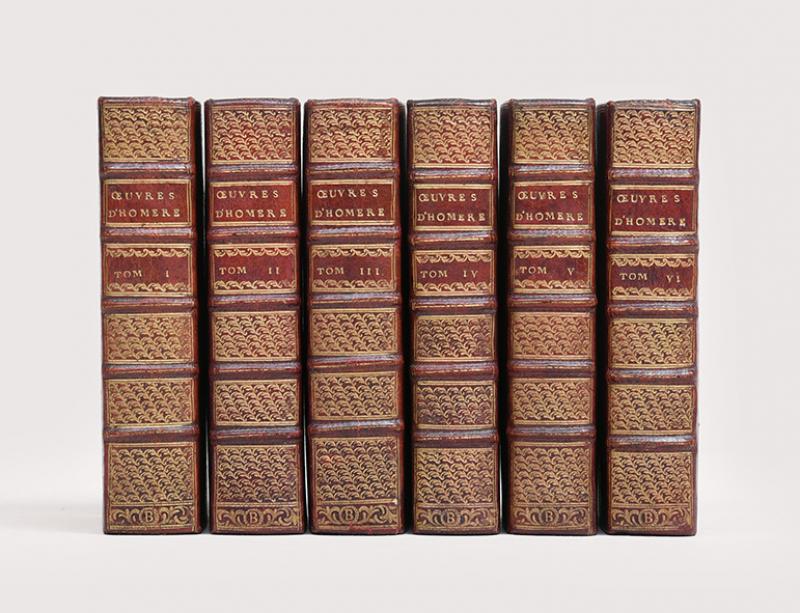
DACIER, Anne Lefèvre (trans.); HOMER.
L’Iliade [and] L’Odyséé, traduite en françois, avec des remarques. Paris: Rigaud, 1711-16. ¶ 2 works in 6 vols, duodecimo (158 x 89 mm). Engraved frontispiece to first vols. of both works by Antoine Coypel, Iliad with 25 engraved plates after Bernard Picart, 2 folding plates depicting Achilles’s shield (one after Vleughels), Odyssey with 24 engraved plates after Coenraad Farret and Wouter Jongman, printer’s device of the Imprimerie Royale to title pages, woodcut initials, head- and tailpieces. Near-contemporary red morocco, spines lettered in gilt, compartments filled with a repeated sprig tool, the initial “B” tooled at foot of spines, triple gilt fillet with corner rosettes to boards, gilt inner dentelles, blue coated endpapers, edges gilt, blue bookmarkers. Front inner hinges of vols IV and V cracked but firm, ink mark to fore edge of vol. I pp. iii-xii, lower corner of vol. VI p. 543 chipped, no loss to text. A very good set indeed in the period binding. ¶ First Dacier editions, extra-illustrated, in beautifully preserved early 18th-century morocco bindings. This exceptional set features the full suite of Picart plates, not issued in all copies of the Iliad, two folding plates depicting the Shield of Achilles from Boivin’s Apologie d'Homère (1715), and the plates issued in the Amsterdam 1731 edition of Dacier’s Odyssey. Dacier’s celebrated translation into French of the Homeric epics, the first by a woman, cemented her place among the foremost classical scholars of her day. The only daughter of the noted Hellenist Tanneguy Lefèvre, Dacier (c.1654-1720) began translating classical works from an early age, beginning with Callimachus and progressing to versions of the poems of Anacreon and Sappho. In 1683 she married her father’s protégé André Dacier, who was a member of the French Academy and who also produced a number of translations, though acknowledged to be of inferior quality to his wife’s works. She was a staunch champion of Homer in the Ancients and Moderns debate, in which she defended his works against what she saw as the contemporary decline in standards of taste. Despite her literary feuds with fellow figures such as Antoine Houdar de la Motte and Thémiseul de Saint-Hyacinthe, and her differences with Alexander Pope, with whom she fundamentally disagreed on how best to approach translating Homer, she was held in extremely high regard by her contemporaries. Even those with whom she fell out “demonstrably regarded her as the eminent authority she deserved to be” (Weinbrot, p. 1). Her professional accomplishments and fine translations were referred to whenever an argument was made in favour of scholarly female education, and she is one of the “distinguished women” featured in Mary Hay’s Female Biography (1803). ¶ H. D. Weinbrot, “Alexander Pope and Madame Dacier's Homer”, Huntington Library Quarterly 62, no. 1/2, 1999.
Sachgebiete: Antike, Altphilologie, Griechenland, Illustrierte Bücher, Literatur bis ca. 1900
9000,- EUR
Differenzbesteuert/Subject to margin taxation
Auf Merkliste setzen 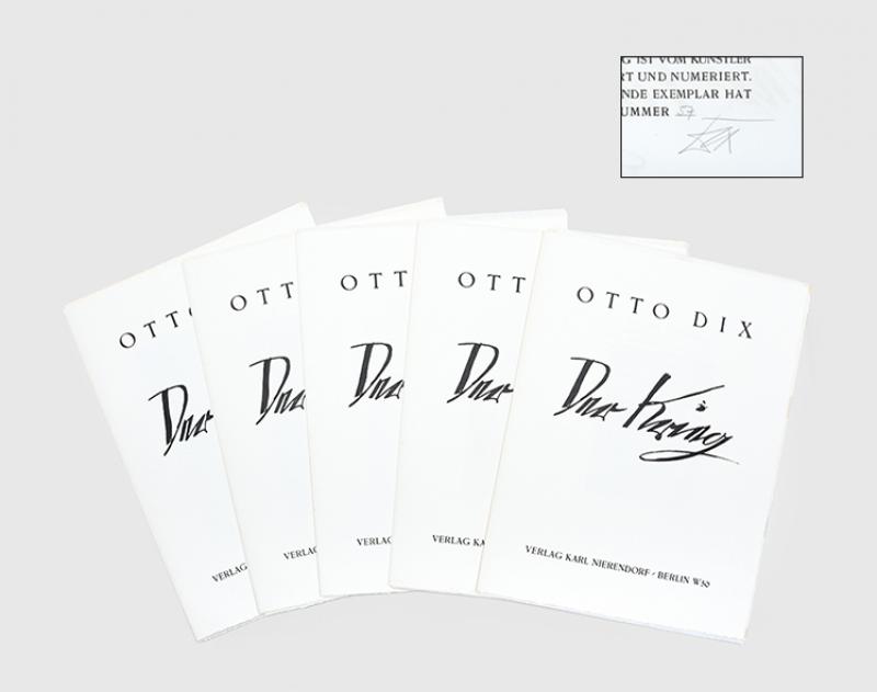
DIX, Otto.
Der Krieg. Berlin: Karl Nierendorf, 1924. ¶ Folio. Comprising 51 etchings with drypoint and aquatint, in 5 paper wrappers, with tissue guards. In the five original grey cloth boxes, string-ties, front covers lettered in black. All housed in a custom purple quarter morocco solander box by the Chelsea Bindery. “Soldat und Nonne” print with residue from mounting, all other plates, wrappers, and boxes in fine condition; some creasing to tissue guards. ¶ First edition, number 57 of 70 portfolios, comprising the full published suite of 50 etchings and the additional 51st print, “Soldat und Nonne”, all signed by the artist; in the five original paper wrappers (each signed and numbered) and boxes as issued. Der Krieg is perhaps the most significant artistic response to the First World War, the 20th-century equivalent of Goya’s Disasters of War. Published on the tenth anniversary of the outbreak of the First World War, the sequence was based on Dix’s service as a front-line gunner in the German Army from 1915 to 1918. “The fifty etchings of this cycle represent Dix's central achievement as a graphic artist... nihilistic landscapes, brutalised soldiery, obscene prostitutes and decaying corpses transmuted into figures of Death, are portrayed with a merciless candour. One print, “Soldat und Nonne”, depicting a nun endeavouring to repel a soldier intent on raping her, was evidently too disturbing and had to be withdrawn from the published edition... Critical acclaim for the prints was enormous, and the portfolios were exhibited in Berlin, Vienna, Breslau, Wiesbaden and elsewhere. More than any other comparable publication, it was regarded as capturing the traumatic experiences of the First World War, which had been horrific, bitter, revolting and occasionally wryly humorous, but never glorious” (Carey, p. 184). It met with fierce resistance from German nationalist circles; in 1937, a complete set was included in the Nazi “Degenerate Art” exhibition. ¶ The “Soldat und Nonne” print is numbered 56 of 70; they do not typically match the portfolio number. ¶ Provenance: Richard Harris, collector of works on death and mortality, who acquired it from C. G. Boerner of Düsseldorf; exhibited at the London Wellcome Collection’s “Death: A Self-Portrait”, 15 November 2012 to 24 February 2013 and the New York Metropolitan Museum of Art’s “World War I and the Visual Arts”, 31 July 2017 to 7 January 2018; sold at Harris’s sale at Bonhams, 9 May 2023, lot 6. ¶ Karsch, Otto Dix: Das graphische Werk, 70-120. Frances Carey, The Print in Germany, 1880-1933, 1984.
Sachgebiete: Deutschland, Geschichte, Illustrierte Bücher, Moderne Kunst, Weltkrieg
450000,- EUR
Differenzbesteuert/Subject to margin taxation
Auf Merkliste setzen 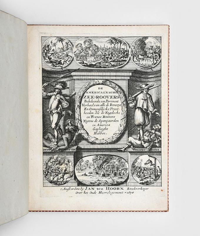
ESQUEMELIN, Alexandre Olivier.
De Americaensche Zee-Roovers. Behelsende een pertinente en waerachtige Beschrijving van alle de voornaemste Roveryen, en onmenschelijcke wreedheden, die de Engelse en Franse Rovers, tegens de Spanjaerden in America, gepleeght hebben (Containing a pertinent and truthful description of all the most important robberies and inhuman cruelties committed by the English and French robbers against the Spaniards in America). Amsterdam: Jan ten Hoorn, 1678. ¶ Small quarto (196 x 153 mm), pp. [vi], 186, [2] adverts. Additional engraved title page, 12 engraved plates (4 double-page). Nineteenth-century red morocco by Rivière, spine gilt, sides panelled in gilt, marbled endpapers, gilt inner dentelles, gilt edges. Custom red morocco clamshell box, felt-lined, richly gilt. Collector’s leather book label of Charles George Milnes Gaskell (1842-1919), MP for Morley. Extremities and front joint repaired, light toning to text leaves and occasional offsetting from plates, some leaves washed, a very good copy.¶ Rare first edition of the original account of swashbuckling pirate exploits in the Caribbean. Known in English as the Buccaneers of America, the book has 12 engravings that bring the fearsome pirate captains to life, and unflinching descriptions of the violence and plunder that both horrified and fascinated readers.¶ Perhaps the most notorious figure in the book is the privateer Henry Morgan (1635-1688). As Morgan's confidante and barber-surgeon, the author Alexandre Olivier Esquemelin (c.1645-1707, also spelled Exquemelin, Esquemeling, Exquemeling, or Oexmelin) had an onboard view of some of the most audacious raids in pirate history, including Morgan’s sack of Maracaibo in 1669 and the daring assault on Panama in 1671 (both depicted in the plates). Esquemelin paints a complex portrait of Morgan - as a brilliant tactician and fearless leader, but also a man capable of great cruelty. Following the publication of the English translation in 1684, which accused Morgan of torture and the use of nuns and monks as a human shield, Morgan took steps to discredit the book and successfully brought a libel suit against the book's English publishers William Crooke and Thomas Malthus.¶ "Perhaps no book in any other language was ever the parent of so many imitations" (Sabin) and it became the cornerstone of pirate literature for centuries to come, Esquemelin's vivid prose and intimate knowledge of buccaneer life captivating readers across Europe. From this edition, it was translated into German (1679), Spanish (1681), English (1684), and French (1686). First editions are of "extreme rarity" (Sabin); we have traced no other complete copy at auction since 1894 (Bangs, 25 April 1894, lot 301), with an earlier record in 1884 (Leavitt & Co., 3 March 1884, 909a). Only six copies have been traced in institutions (USTC). ¶ Howgego E39; Sabin 23468; USTC 1814458.
Sachgebiete: Amerika, Geschichte, Illustrierte Bücher, Literatur bis ca. 1900, Reisen/Reiseliteratur
150000,- EUR
Differenzbesteuert/Subject to margin taxation
Auf Merkliste setzen 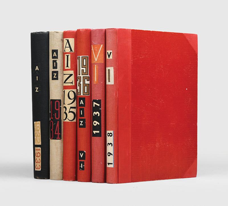
HEARTFIELD, John.
Arbeiter Illustrierte Zeitung & Die Volks-Illustrierte. Berlin: Neuer Deutscher Verlag, & Prague, P. Prokop, 1932-38. ¶ Together, 314 issues bound in 6 vols, folio (375 x 265 mm). With photographic illustrations throughout. Contemporary black, red, or white quarter cloth, paper-covered boards, printed paper labels to spines; each volume with manuscript half-title and title in German, vols. I and II with manuscript German table of contents. Contemporary label of the Dutch Communist Party to front free endpapers of vols. I & II. Light browning due to paper quality, very occasionally slightly trimmed (with minor loss of letters), a few pages creased, and occasional small tears; 3 leaves with longer tears and 2 with minor loss. Still, a very good set.¶ An exceptional run of one of the main organs of political opposition to the Nazi Party, illustrated with photographs throughout. It includes over 200 of John Heartfield’s iconic photomontages, pioneering works of graphic design and illustration which were extraordinarily influential.¶ The Arbeiter Illustrierte Zeitung, renamed Die Volks-Illustrierte in 1936, was a socialist photographic weekly magazine. Founded in Berlin in 1921, it took a leading role in opposing the growing Nazi movement. After the Nazis came to power, its publishing operation fled to Prague, where it was distributed across Europe to opponents of the new regime and to émigrés, as well as being smuggled into Germany. As the German occupation of Prague loomed, the magazine ceased publication. This set comprises the full run from 1932 through to the magazine’s closure in 1938, with the exception of a single issue in 1935 that was suppressed, and the few issues of the aborted attempt to revive the magazine in Strasbourg in 1939. It has the label of the Dutch Communist Party, which was itself later suppressed under Nazi occupation. The 314 issues contain several thousand photographs illustrating inter-war Europe and the Nazi movement and regime. Its journalism is a crucial record of Nazi repression at a time when the domestic press was rigidly controlled by Goebbels’s propaganda apparatus. There are also articles for children, sports coverage, caricatures, fiction, and essays about art and technology. Heartfield’s illustrations have secured the magazine’s lasting fame. “In the search for new forms to express a new conviction, Heartfield and his friends discovered photomontage. Originally, it seems that the soldiers on the Western Front, unable to get their reports of butchery past the censors, turned to pasting together photographs and cutouts from illustrated papers to tell their tale of horror to their families and friends back home. Using this ingenious technique, as well as the collage of the cubists, Heartfield and his close friend, George Grosz, invented the new technique” (Selz, p. 310). The rise of National Socialism gave Heartfield his defining subject, and his work for the Arbeiter Illustrierte Zeitung and Die Volks-Illustrierte includes many of his most famous images. ¶ Peter Selz, “John Heartfield’s ‘Photomontages’”, in The Massachusetts Review, Vol. 4, No. 2, 1963.
Sachgebiete: Deutschland, Militaria, Photographie, Weltkrieg
45000,- EUR
Differenzbesteuert/Subject to margin taxation
Auf Merkliste setzen 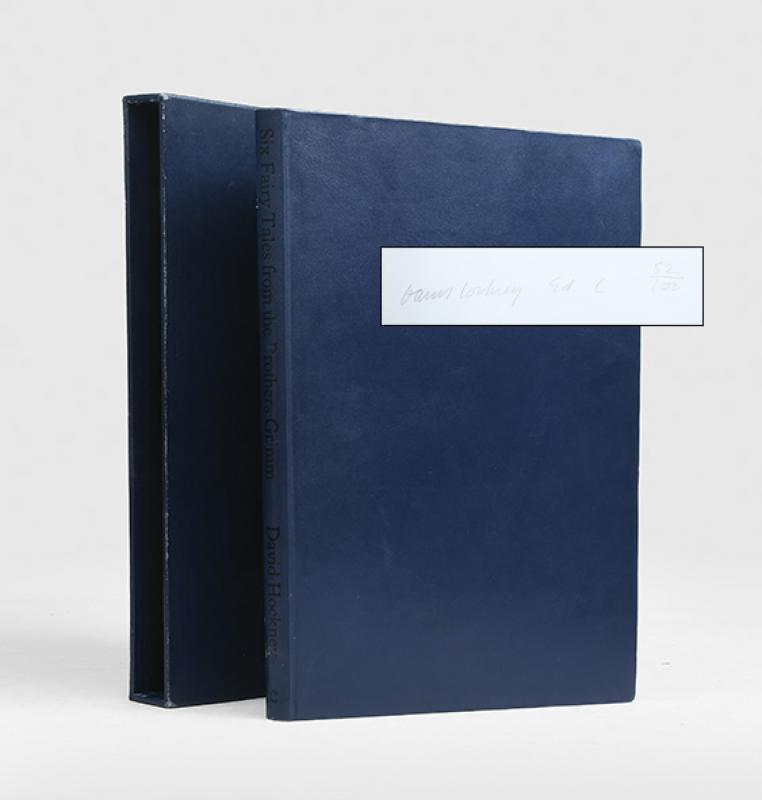
HOCKNEY, David - GRIMM, Brothers.
Six Fairy Tales from the Brothers Grimm with original etchings. London: Petersburg Press in association with the Kasmin Gallery, 1970. ¶ Folio. Original full dark blue calf, lettering to spine in black. Frontispiece and 38 black and white full page original etchings, all printed on W. S. Hodgkinson watermarked 192 gsm paper, signed by Hockney on the limitation leaf. Together with a full dark blue calf folder housing 6 loose original etchings on W. S. Hodgkinson watermarked 298 gsm paper, each signed by Hockney, each sheet 45.1 x 31 cm. All contained in a dark blue calf slip case. Slipcase rubbed to edges with light indentations to front cover, otherwise a bright near fine copy. ¶ First edition, first impression, edition C. The titles of the six signed loose etchings are: The Lake; The Older Rupunzel; Home; The Bell Tower; Corpses on Fire; The Princess After Many Years in the Glass Mountain. The book was printed in four editions of 100, A,B,C & D. Each volume was accompanied by a different set of 6 loose signed etchings. A portfolio edition was also published in an edition of 100 containing all 39 etchings signed. The etchings were drawn on copper plates between May and November, 1969, and printed by Piet Clement, Amsterdam.
Sachgebiete: Märchen/Sagen, Erstausgaben, Illustrierte Bücher, Moderne Kunst, Pop Art
85000,- EUR
Differenzbesteuert/Subject to margin taxation
Auf Merkliste setzen 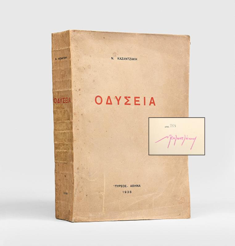
KAZANTZAKIS, Nikos.
Odyseia. Athens: Pyrsos, 1938. ¶ Folio. Original buff wrappers, spine and front cover lettered in red and black, gatherings unopened. Spine and extremities restored, with a couple of letters retouched, a little spotting and marks on sides, slight foxing to edges, small hole at foot of initial blank. A very good copy. ¶ First edition, number 268 of 277 copies numbered in Roman numerals and signed by the author, from a total edition of 301 copies. Kazantzakis’s major work is an ambitious sequel to Homer’s Odyssey and one of the “very first monuments of European Modernism” (Gonzáles-Vaquerizo, p. 104). This is the only copy in wrappers that we have traced on the market and in auction records. Kazantzakis (1883-1957) began writing Odyseia in 1924, during a period of intense personal turmoil after he returned to his native island of Crete. The poem is deeply autobiographical, with many characters inspired by people he met in real life. It was published after fourteen years of revisions and seven rewritings. The text mirrors the structure of Homer’s Odyssey, divided into 24 rhapsodies, but is roughly twice as long and employs an experimental style marked by abundant neologisms and intricate syntax. The plot follows Odysseus after his return to Ithaca: restless in domestic life and driven by an insatiable desire for freedom, he embarks on a series of new journeys culminating in his arrival in Antarctica. ¶ Helena Gonzáles-Vaquerizo, “Kazantzakis Odyssey as a Cretan and Modernist Masterpiece”, in Liana Giannakopoulou & E. Kostas Skordyles, eds, Culture and Society in Crete, From Kornaros to Kazantzakis, 2017.
Sachgebiete: Griechenland, Literatur ab ca. 1900
11500,- EUR
Differenzbesteuert/Subject to margin taxation
Auf Merkliste setzen 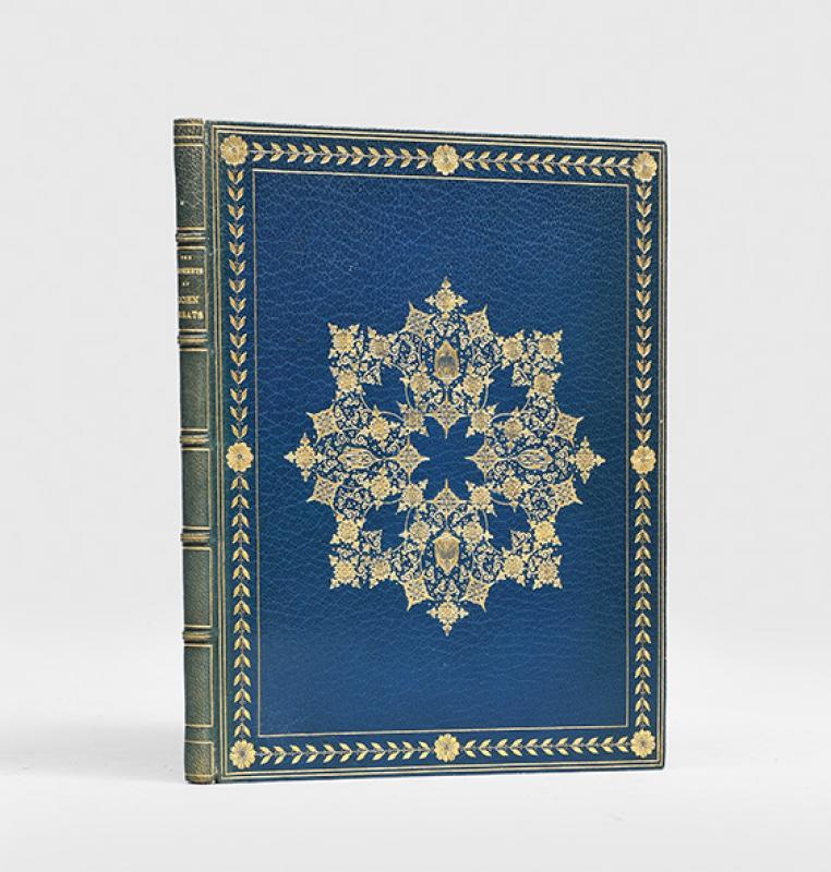
KEATS, John.
Sonnets. [c.1900]. ¶ Quarto (215 x 175 mm). Title within wood-engraved border, wood-engraved initials throughout. Contemporary bright blue crushed morocco, spine lettered in gilt, compartments framed with single gilt fillet, boards with double gilt fillet enclosing broad border of leafy stems interspersed with floral tool, framing large central flower-shaped medallions elaborately tooled with two different lozenge tools, two stylized bulb tools, and fine single dot curlicues, gilt-ruled turn-ins with floral tool and single dot details at corners, top edges gilt, fore and bottom edges uncut. Spine sunned, flyleaves toned from turn-ins, a couple of spots of foxing to edges, still a fine copy. ¶ A consummate example of British provincial fine binding: this elegantly printed selection of Keats’s verse was bound by the renowned Staffordshire firm of Bagguley. The bindery employed some of the generation’s best finishers; the quality of their work is clear here from the filigree-like medallions, carefully built up with many different tools. ¶ The bookseller George Thomas Bagguley (b.1860) established himself in Newcastle-under-Lyme in 1890. Some of the top finishers in Britain moved from urban centres to practise in the bindery arm of the business, which, unusually, hired external designers. It flourished briefly but spectacularly around the turn of the century. “Quite how a small market-town... could support a bindery producing a work of this quality is not clear” but, as it was, Bagguley bindings featured in some of the 20th century’s finest collections (The Wormsley Library catalogue, p. 87). This binding has the bookplates of W. A. Foyle (1885-1963), the founder of the famous Charing Cross Road bookshop, and the distinguished bookseller and collector Robin de Beaumont (1926-2023). The volume bears no imprint or date, but the endpapers are watermarked 1900. We have traced another copy of this edition in a Bagguley binding. ¶ The Wormsley Library: a personal selection by Sir Paul Getty, Catalogue of an exhibition held at The Pierpont Morgan Library, New York, 27 January - 2 May 1999.
Sachgebiete: Einbände, Literatur bis ca. 1900, Großbritannien
5700,- EUR
Differenzbesteuert/Subject to margin taxation
Auf Merkliste setzen 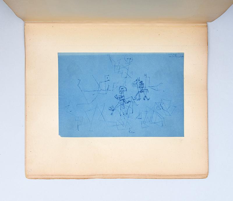
KLEE, Paul.
Maquette for Handzeichnungen 1921-1930. Düsseldorf: 1934. ¶ Maquette: Quarto. Original hand-bound black card covers (28.1 x 24.2 cm). With 69 cyanotypes of different sizes mounted on card after original drawings by Klee. Book: Quarto. Original yellow boards, spine and front cover lettered in black, illustration after Klee on front cover in black. With 72 full-page illustrations after original drawings printed on heavy card with perforation to the inner margin. Housed in a black cloth flat-back box by the Chelsea Bindery. Maquette: covers and most pages disbound with small loss to corners and edges, lacking pages 16, 26, and 27. Book: small loss to joints of spine, otherwise clean and bright, a very good copy. ¶ Original maquette for the first volume of Klee's Handzeichnungen, accompanied by a first edition of the book, number 33 of 525 copies. Most of the edition was later confiscated by the Nazis. The maquette is signed by the art critic Will Grohmann, author of the introduction, and both maquette and book were owned by two expressionist dancers associated with the 1936 Berlin Olympics. ¶ Grohmann planned a three-volume catalogue raisonné of Klee’s work, despite mounting criticism from the Nazi Party. In 1933 Klee was dismissed from his teaching post in Düsseldorf and fled to Switzerland. The first volume appeared in October 1934; by spring 1935 the remaining copies were seized by Nazi officials, and Grohmann was forced to suspend publication of the projected second and third volumes. In 1937 Klee’s work was included in the Nazi exhibition of so-called “degenerate art”. The first edition bears the ownership inscription of the dancer and choreographer Mary Wigman, together with a presentation inscription in Grohmann’s hand: “Mary Wigman, Im Alter treu ist Freundschaft ("loyal friendship in old age"), 13 Nov. 1934”. Wigman was a pioneering figure of expressionist dance and a cultural icon of Weimar Germany. She later collaborated with the Nazi regime, accepting a commission for the 1936 Olympics; although privately sympathetic to Jewish students, she complied with orders to dismiss Jewish dancers from her company. The maquette was presented to the dancer Mathilde Thiele (b. 1907), who typed Grohmann’s introduction. Thiele studied under Gret Palucca, later taught Dore Hoyer, and in the 1960s joined the staff of Wigman’s school. When Palucca was summoned to dance for Hitler at the 1936 Olympics, Thiele accompanied her as rehearsal director. Thiele later recalled the dinner with Hitler, noting the mortal danger had Palucca’s Jewish background been known. "After dinner, Palucca and I were so relieved we drank a whole bottle of wine in our room. We considered that Herr Goering might help Palucca escape if needed. We had word that he helped artists (even Jews) through an underground operation, despite his close relationship to Hitler" (Fraleigh). ¶ Grohmann 2226 & others. Sondra Fraleigh, “Mathilde Thiele, A Life in Dance and War”, 2021.
Sachgebiete: Handzeichnungen, Deutschland, Moderne Kunst, Politik, Weltkrieg
60000,- EUR
Differenzbesteuert/Subject to margin taxation
Auf Merkliste setzen 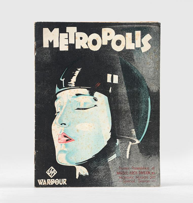
LANG, Fritz (dir.).
Metropolis: Premier Presentation at Marble Arch Pavilion, W.1. Monday, March 21st. Special Season. [Titlepage:] “Metropolis” Magazine. Depicting Scenes, Story and Incidents in the Making of the World’s Greatest Modern Spectacular Film Masterpiece... London: Wardour Films Limited, 21 March 1927. ¶ Quarto (248 x 189 mm). Single quire, wire stitched, pp. 32. Original pictorial wrappers, monochrome lithograph with blue and red colouring. Many photographic illustrations, portraits and stills from the film. Slight rusting to staples, light foxing to covers, otherwise in very good condition. ¶ Striking souvenir programme for the British premiere of Lang’s masterpiece. Included among statements by the producer, cast and principal crew are some marvellous descriptions and scenes from the making of the film. A full synopsis is given and a particularly interesting section, entitled “Death to the Machines! These pages show how Thea von Harbou constructed the scenario of ‘Metropolis’ from the lines of her novel”, illustrates in parallel text how passages of film were adapted from the fictional source. Metropolis had its premiere at the Ufa-Palast am Zoo in Berlin on 10 January 1927. The arresting cover image - depicting Maria in the headpiece that transfers her animus to her robotic double - is taken directly from the original German poster artwork by Kurt Degen, a leading designer who created posters for Murnau’s Nosferatu (1922), Frankenstein, and M (both 1931). Decidedly scarce: very few copies appear in commerce.
Sachgebiete: Film, Science fiction, Großbritannien
6000,- EUR
Differenzbesteuert/Subject to margin taxation
Auf Merkliste setzen 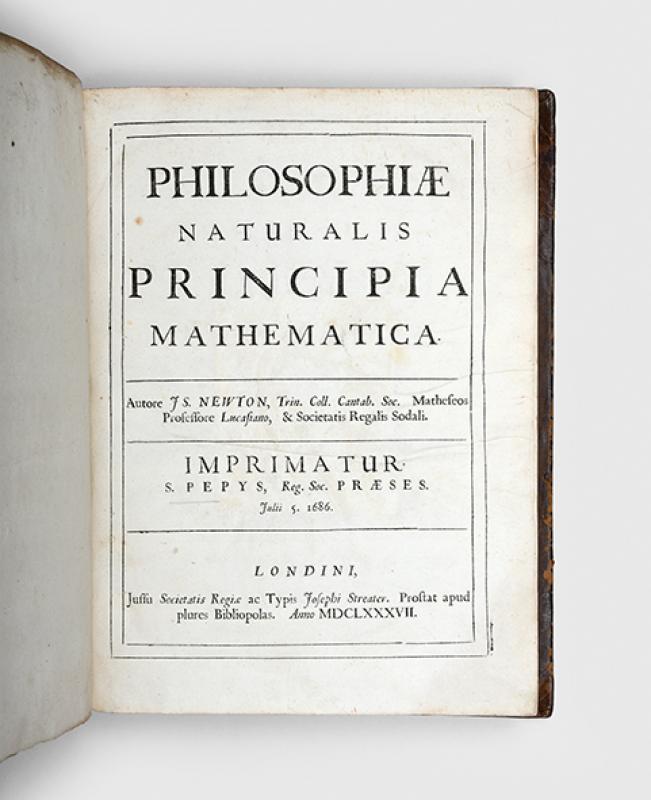
NEWTON, Isaac.
Philosophiae naturalis principia mathematica. London: Joseph Streater for the Royal Society, 1687. ¶ Quarto (240 × 185 mm), pp. [viii], 510 [= 494, page numbers 384-99 omitted because of a change of compositors], [4] (errata and final blank). Folding engraved plate illustrating a comet, woodcut diagrams in text. Contemporary mottled calf, rebacked preserving original spine and recornered, compartments with ornamental frames and central bouquet motif tooled in gold, panelled and with flower cornerpieces in blind, edges sprinkled red. Occasional light toning and spotting, title a little loose, small hole in 2D4 affecting one word on recto only, printing flaw in 2S4 affecting text on five lines on recto and four and verso, small paper flaw in 3M3; a very good copy. ¶ First edition, first issue, of the crowning work of the Scientific Revolution. The Principia represents the first great unification of modern science, presenting Newton's three laws of motion and his law of universal gravitation. Where Copernicus, Galileo, and Kepler had described the phenomena they observed, Newton explained the underlying laws of motion governing the universe. The Principia marked the first time that a single mathematical framework could explain the motion of objects both on earth and in the heavens. “It was this grand conception that produced a general revolution in human thought, equalled perhaps only by that following Darwin’s Origin of Species” (PMM). The work brought together several of the leading figures of the Scientific Revolution. Prompted by Newton's dispute with Robert Hooke over the inverse-square law, it was financed and edited by the future Astronomer Royal, Edmond Halley, and drew on the observations and advice of the contemporary Astronomer Royal, John Flamsteed. In their 2020 census of first edition copies, Mordechai Feingold and Andrej Svorenčík suggest a print run of 600-650 copies. Printing was completed by 5 July 1687, by which date Halley had already sent Newton 20 copies for himself and a further 40 "to put into the hands" of Cambridge booksellers. Halley later granted Samuel Smith exclusive distribution rights on the Continent, leading Smith to issue a new title page with a three-line imprint and his name added to it. Feingold and Svorenčík estimate that copies with the three-line imprint constitute about one-third of the edition. This copy has leaf P4 in the cancelled state, produced to correct the orientation of the woodcut diagram on page 112. ¶ Provenance: early manuscript shelf mark and note on front pastedown, possibly that of Wriothesley Russell, 2nd Duke of Bedford (1680-1711), his armorial bookplate dated 1703 on title page verso - Edward Neville da Costa Andrade, FRS (1887-1971), British physicist, his bookplate - sold at Andrade’s sale, Sotheby’s, 12 July 1965, lot 371 to - anonymous owner - sold at Sotheby’s, 18 October 1977, lot 300, to Blackwell. A distinguished scientist, elected a Fellow of the Royal Society in 1935, Edward Andrade was also a notable book collector, assembling a collection centred on the 17th century, particularly the works of Newton, Hooke, and Boyle. An active member of the Royal Society's Library Committee for many years, he played an important role in its publication of the correspondence of Isaac Newton. His biography of Newton appeared in 1954. ¶ Babson, pp. 9-10; Dibner 11; ESTC R5707; Gray 6; Grolier/Horblit 78; Grolier Science 78; Norman 1586; Osler 1024; Printing and the Mind of Man 161; Sparrow 151; Todd E1; Waller 12159; Wing N1048. Mordechai Feingold & Andrej Svorenčík, "A Preliminary Census of Copies of the First Edition of Newton's Principia (1687)", Annals of Science 77, 2020, no. 334.
Sachgebiete: Wissenschaftsgeschichte, Mathematik, Naturwissenschaften, Physik
1200000,- EUR
Differenzbesteuert/Subject to margin taxation
Auf Merkliste setzen 
OTSUKI, Gentaku.
Kankai ibun (“Strange Tales of a Circumnavigation”). [Japan: 1807-19]. ¶ 14 parts in 5 vols, large octavo, manuscript on recto and verso of each leaf. With 82 manuscript drawings (63 hand-coloured, 1 loosely inserted), 2 manuscript maps (1 hand-coloured); text in classical Japanese. Original blue cloud-patterned wrappers, renewed grey thread fukuro-toji binding, manuscript title labels on front wrappers. Contemporary inscription of one Mr Naito, Buheicho, Nagoya, on final page of each vol., later manuscript catalogue note loosely inserted. Wrappers worn and creased, thread loose in places but stable, occasional worm-holing and tidemarks internally: a very good example. An early manuscript copy, recounting the travels of four Japanese sailors shipwrecked in Russia and their return to Japan aboard Krusenstern’s voyage. Besides a map tracing the route, it contains many accomplished illustrations, including a portrait of two indigenous Hawai’ians, a depiction of a Russian planetarium, and many diagrams of Western clothes. ¶ In late 1793, the vessel Wakamiya-maru set sail for Edo, but storms drove it off course to the Aleutian Islands. After months, the crew were discovered and taken to Russia, where they remained for the next decade. In 1803, Tsar Alexander I asked the 10 surviving crewmen whether they wished to return to Japan aboard Krusenstern and Rezanov’s famous circumnavigation. Four agreed - Tsudayu, Gihee, Sahei, and Tajuro - who were accompanied by a fifth, Zenroku, working as Rezanov’s interpreter. They arrived in Nagasaki in 1804, becoming the first Japanese people to travel around the world. They were interrogated by the scholar Otsuki Gentaku, whose write-up of the interviews, Kankai ibun, circulated in manuscript in 16 volumes from 1807. Their story captured great attention at a time when it was still punishable by death for Japanese people to leave the country and accounts of the outside world were scarce. There is much attention paid to the technology and culture they saw in Russia, as well as their experiences in Britain, Brazil, the Canary Islands, and Hawai’i. The red ownership stamp of the poet Shimosato Denpo (1762-1819) dates this copy to the early 19th century. Textually it matches the Waseda University Otsuki-bon copy. The scribe omits the preface volume and Volume 14, although he includes the world map from the preface in Volume 1. The illustrations generally match those identified by the historian, linguistics researcher, and bibliographer of Kankai ibun, Sugimoto Tsutomu.
Sachgebiete: Asien, Buchmalerei, Japan, Russland, Reisen/Reiseliteratur
21000,- EUR
Differenzbesteuert/Subject to margin taxation
Auf Merkliste setzen 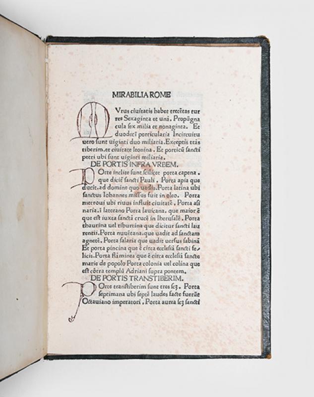
ROME GUIDEBOOK.
Mirabilia Romae. [Sant’Orso: Giovanni de Reno, c.1475]. ¶ Quarto (195 x 138 mm): [a8]; 8 leaves, unnumbered. Roman type 97R, 28 lines per page. Watermark: scale in a circle. Mid 19th-century green morocco, elaborate gilt and blind floral frames to covers, gilt monogram “AF” and crest of the Duke of Genoa and Prince of Savoy Ferdinando Alberto di Savoia-Carignano (1822-1855) in center of front and rear covers respectively, board edges tooled in gilt, pink endpapers, edges gilt. Housed in a custom green cloth solander box. Professionally recased and refurbished, including discreet repair at spine ends, one corner, and the gilt retouched, peripheral browning to endpapers from binder’s paste, contents lightly foxed. A very good copy, attractively bound. ¶ A rare incunable edition of the earliest European printed guidebook, a geographically arranged inventory of the “unmissable” monuments and sites of Rome. This copy was handsomely bound in green morocco for the library of Prince Ferdinando of Savoy, first duke of Genoa, with his coat of arms and initials in gilt on the covers. Dubbed by PMM the “Renaissance Baedecker”, Mirabilia Romae (“The marvels of Rome”) was composed about 1140-50 by an anonymous writer - sometimes identified as Benedict, Canon of St Peter’s - as a guide for the pilgrims to the city. First printed in the early 1470s, it was reprinted multiple times over the following century, and translated into Italian, English, Spanish, and German. The great popularity of this work during the Renaissance illustrates a new awareness of the significance of ancient Roman remains and “was instrumental in preserving some of them. The Memorabilia is a valuable source for our knowledge of what remained and attracted notice in medieval Rome. One of its pleasant side-effects was the beginning of measures for the ‘protection of ancient monuments’ - such as Trajan’s column - as the Roman authorities realized their importance for tourism” (PMM). “The author of the Mirabilia concentrates attention on ancient Rome; churches serve only to locate the presumed site of an ancient building or sanctuary. Thus he leads a systematic tour through the ancient city, always focusing on the monuments; their identification from literary references, though important, is secondary. Starting at the Vatican, he lists the obelisk - its globe contains, as [the author] is the first to say, Caesar’s ashes; the two mausolea - one presumed to be a temple of Apollo; and the pigna and its canopy in the atrium. Thence he moves to the Mausoleum of Hadrian and other ancient monuments nearby; across the river to the Mausoleum of Augustus, the Pantheon, and the other temples of the Campus Martius; and as the climax, to the Capitol and its long-lost temples, to the Forum and the Palatine. A tour of ancient monuments... terminates the survey” (Krautheimer, p. 199). This is one of the earliest known editions. ISTC lists eight editions conjecturally printed in the 1470s, of which all except the edition printed at Treviso by Gerardus de Lisa, de Flandria, 12 April 1475, is without a specified date or place. All are exceedingly rare, and only two of the eight editions have appeared in commerce in modern times. A copy of this edition and a copy of the Treviso edition were lots 282 and 283 in the Kissner sale at Christies London, October 1990, and another copy of this edition was offered at Sotheby’s London in 2011. ISTC counts 13 holding institutions of this edition. This edition is assigned to the printer Giovanni de Reno, active in Sant’Orso (Valle d’Aosta, Italy), based on the type and watermark. “This edition, like that of De Lisa, Treviso, 12 April, 1475, has at the end a chapter concerning ‘Totilae exasperatio in servos Dei’. The chapter headings are at first printed in capitals, as in De Lisa’s edition, but revert to minuscules on 2b. While it thus appears to be certainly a reprint of De Lisa’s work and while the watermarks link it with Sant’Orso, the 9 (upper case) is throughout set at the medium height characteristic of De Reno’s work in 1473. Probably it is an early production at Sant’Orso, printed with a remainder of old type” (BMC VII 1027). Provenance: a) Prince Ferdinando Maria Alberto of Savoy (1822-1855), son of the King of Sardinia Carlo Alberto and founder of the Genoa branch of the House of Savoy. He owned a substantial library, mostly focused on military books. In addition to the supralibros, this copy has the prince’s ownership label lettered “Biblioteca di S[ua]. A[ltezza]. R[eale] Il Duca di Genova” and a shelf-label “C. II-32” on the front pastedown; his library stamp (faded) on the rear free endpaper. b) Early 20th-century bookplate of a member of the Asinari di Rossillon family of Bernezzo, likely Giuseppe Mario (1878-1943), marquis of Bernezzo, with his bookplate on the front free endpaper verso; he was army general and first aide-de-camp to King Emanuele II. ¶ BMC VII.1027; Goff Suppl. M591a; GW M23540; ISTC im00590600. Richard Krautheimer, Rome: Profile of a City, 2000.
Sachgebiete: Einbände, Inkunabeln, Italien, Reisen/Reiseliteratur, Reiseführer
72000,- EUR
Differenzbesteuert/Subject to margin taxation
Auf Merkliste setzen 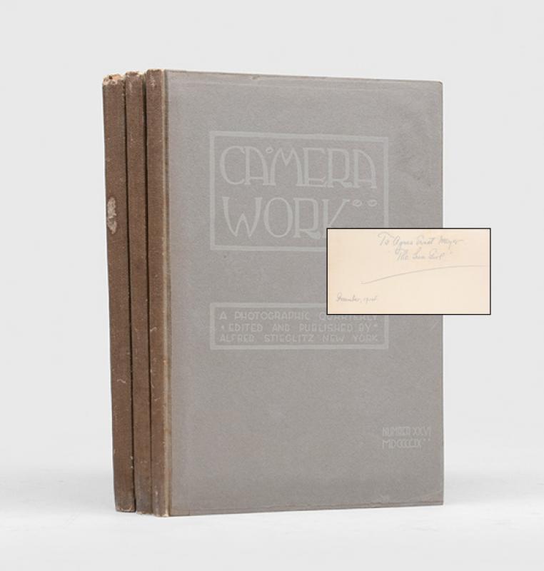
STIEGLITZ, Alfred.
Camera Work. Nos. 1, 25, & 26. 1903 & 1909. ¶ Three vols, tall quarto. With 24 hand-pulled photogravures and 1 photogravure (not hand-pulled). Bound for presentation in grey quarter cloth, preserving original wrappers pasted onto grey paper-covered sides. Edges worn, faint foxing and offsetting to a few leaves, more so to No. 1, slight loss at head of spine of No. 1, neat paper repair to front cover: a near-fine set. A full description is available on request. ¶ Three issues of the seminal photography periodical, including the inaugural issue, each a presentation copy inscribed by Stieglitz to his friend and collaborator, the philanthropist and civil rights activist Agnes E. Meyer. ¶ Camera Work was a quarterly publication that circulated work by some of the world’s most important photographers. Stieglitz showcased photography as a fine art and his journal has been called “by far the most beautiful of all photographic magazines” (Whelan). These issues contain 25 photogravures, primarily by members of the Photo-Secession movement. Photographers represented here include founder-members Gertrude Käsebier and Frank Eugene, the iconoclast Anne W. Brigman, and the distinguished portrait photographer Alice Boughton. Meyer was an activist and patron of the arts. One of the first woman journalists hired by the New York Sun, Meyer was nicknamed the “The Sun Girl” in Stieglitz’s artistic circle. She was one of his “she Graces”, together with the artists Katharine Rhoades and Marion Beckett. Together, she and Stieglitz created and published the art magazine 291 between 1915 and 1916, notable for its printing of the earliest example of visual poetry in America - written by Meyer. Her marriage to the financier Eugene Meyer allowed her the wealth and freedom to advocate for social causes. She influenced national policy by lobbying for the creation of the Department of Health, Education, and Welfare, and her husband’s ownership of the Washington Post gave her a platform to criticize Nixon, campaign against racial inequality, and lampoon McCarthyism as a threat to liberty. Issue I is inscribed on the front free endpaper, “To Agnes Ernst Mayer, ‘The Sun Girl’, December, 1914”; No. XXV is inscribed on the first blank, “To Agnes E Ernst, with cordial greetings and best wishes, AS. NY, Dec 21/[illegible, perhaps 08]”; No. XXVI is inscribed on the first blank, “With kindest regards, cordially, AS. To Agnes Ernst. Paris. March 10 - 1909”. ¶ Richard Whelan, Alfred Stieglitz: A Biography, 1995.
Sachgebiete: Photographie
40000,- EUR
Differenzbesteuert/Subject to margin taxation
Auf Merkliste setzen 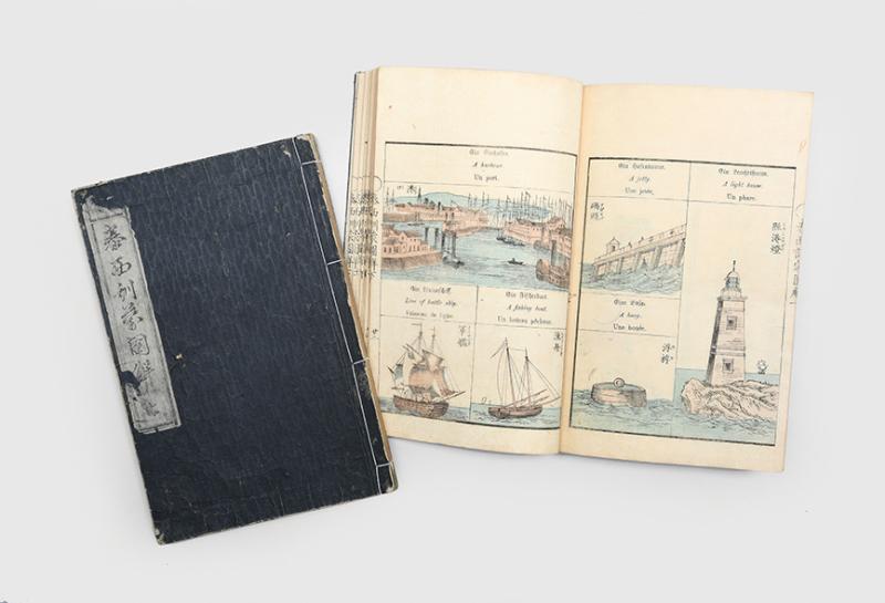
TANAKA, Yoshio.
Taisei kunmo zukai (“An Illustrated Encyclopaedia of the West”). [Tokyo:] Monbusho, 1871. ¶ 2 vols, octavo. Colour woodblock and copperplate illustrations throughout; text in Japanese, English, French, and German. Original black patterned wrappers, renewed white string fukuro-toji binding, original printed label on front wrappers. Housed in modern blue cloth folding case with manuscript title label. Red ink seals of the English literature scholar Masaaki Sogo (1912-1993), remains of former printed label on inner rear wrapper of vol. I. Wrappers generally rubbed and creased, a little loss to labels, contents bright with minor worm-holing repaired: a very good copy. ¶ First edition of this colourful illustrated encyclopaedia, produced by the Ministry of Education to introduce various Western items and their names in English, French, and German. It was released only four years into the Meiji period by Tanaka Yoshio, a prominent naturalist and zoologist who oversaw the founding of the National Museum of Natural History and Ueno Zoo. Taisei kunmo zukai adopts the format of traditional Japanese encyclopaedias but applies multi-lingual captions. It opens with examples of European architecture, houses, and furniture, before moving to kitchen utensils, tools, clothing, gardening equipment, domestic animals, sports, railways, ships, and weaponry. The categorisation reflects the ongoing process of modernising scientific and technical knowledge in Japan. For example, as noted by W. Puck Brecher, the separation of animals into “domesticated” and “wild” subsections was a holdover from the early modern period, where animals were classified by their usefulness or danger to society. Taisei kunmo zukai “interprets ‘wild’ not simply as undomesticated, but as unmanageably savage and ferocious... The wildlife section includes illustrations of a hunter and a forest to instruct readers about the propriety of human dominion over the wild” (Brecher, p. 86). This contrasts with emerging Western models of zoological classification, showing how the late 19th century was in a state of flux between traditional and modern ideas. ¶ W. Puck Brecher, Loving and Loathing Wildlife in Japan, 2025.
Sachgebiete: Asien, Lexika, Illustrierte Bücher, Japan
3300,- EUR
Differenzbesteuert/Subject to margin taxation
Auf Merkliste setzen 
TEXTILES AND DESIGN.
Pair of salesman’s pattern books, containing over 1,000 finely woven textile samples. [Likely Norwich: c.1820s]. ¶ 2 vols, tall octavo (260 x 150 mm). With 1,063 unique samples of varying sizes, mounted on rectos of 125 leaves printed in ornamental blue (2 folding at fore edge), manuscript titles and numbers direct to leaves or on labels. Contemporary blue paper wrappers, manuscript number or label on inner front covers. Housed in 19th-century calf pull-off box, green lining and gilt decoration. Within custom blue cloth box with red label by James Brockman. Samples fine and bright, wrappers creased, pull-off box worn: a well-preserved collection. ¶ A prepossessing collection of textile swatches for clothing or furnishing, likely produced in Norwich for selling to the German market. Using the whole spectrum of colours, the designs incorporate stripes, geometric shapes, diaper patterns, zigzags and chevrons, floral and foliate motifs, and ikat designs. The samples are arranged by pattern under titles in German and, at times, French and Italian. These include, for example, Weisbodige Croisé (white strips and colour chevron-pattern stripes), Rothbodige Köper (thick red stripes alternating with those of other colours), and Cuttni (multicolour swatches with fine diaper or lozenge patterning). The samples are woven from wool, a factor - together with their design - that points to their origin in Norfolk. “The presentation of choice in the books of samples from Norwich is literally fascinating, with some pages so stunning and dazzling in their effect and we might argue that it could be the effect of the whole page that seduces the buyer, rather than the individual sample... The almost infinite variations of colour and pattern, accentuated in their intensity in the context of a book or card, create an eye-catching and infectious spectacle” (Mitchell). Accompanying these books are two other unrelated sets of several dozen samples, both dating from later in the 19th century and at least one from France. Provenance: Cora Ginsburg (1910-2002), the expert in fine textiles, purchased by her in England in 1962 - Stephen C. Massey. ¶ Victoria Mitchell, “A Marketplace in Miniature: Norwich Pattern Books as Cultural Agency.”
Sachgebiete: Mode, Möbel, Textilien, Großbritannien
18000,- EUR
Differenzbesteuert/Subject to margin taxation
Auf Merkliste setzen 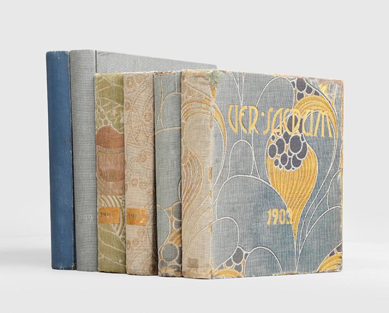
VIENNA SECESSION.
Ver Sacrum: Organ der Vereinigung Bildender Künstler Österreichs. Vienna and Leipzig: Gerlach & Schenk; E.A. Seemann, 1898-1903. ¶ 120 numbers bound in 6 annual volumes, quarto; the first two volumes 289 x 282 mm, the latter four 254 x 238 mm. Illustrated with 471 reproductions of drawings, 55 lithographs, and 216 woodcuts (most printed in colour). This set includes the extra number for the first year (catalogue of the Second Secession Exhibition) and the Calendar number for the sixth year. Vols. I-II in 20th-century blue and grey cloth, front covers lettered in gilt, patterned endpapers, top edges gilt, others trimmed; Vols. III-VI in floral-patterned cloth, patterned endpapers, top edges gilt, other uncut. Original wrappers bound in vols. I-III. Vols. II and IV with “Feuerbacher Heide” bookplate of industrialist Hans Lutz Merkle (1913-2000). Slight fraying at extremities and minor sunning to spines, contents with some spotting and toning but generally clean and bright, Vol. I with some cropping of pagination at foot and minor loss to wrapper of August 1898 issue. An excellent set. ¶ First editions, a very scarce complete run of one of the most consequential artistic journals ever published, the organ of the Vienna Secession, bound in annual volumes, the latter four in floral cloth bindings likely by the Wiener Werkstätte. The Vienna Secession was a group of Austrian artists, led by Gustav Klimt, who, in 1897, broke away from the conservative Künstlerhaus to promote modern art and the ideal of the Gesamtkunstwerk, or total work of art. Ver Sacrum (“Sacred Spring”) was their journal, which sought to integrate ornament, typography, layout, design, and text into a unified artwork. It included photographs of the Secession’s own exhibitions, and texts were contributed by many leading poets and writers of the day. Literary and artistic contributors included Max Kurzweil, Rainer Maria Rilke, Maurice Maeterlinck, Hugo von Hofmannsthal, Alphonse Mucha. “Ver Sacrum remains a document of the first importance for any student of the period, and one without which it would be impossible to obtain a complete picture of the activity of the Secession” (Vergo, p. 44). The introductory essay declared that it “aims to show other countries for the first time that Austria is an independent artistic entity... it is meant to be a clarion call to the artistic sense of the people, to inspire, promote, and spread artistic life and artistic independence” (translated). The bindings of the latter four volumes are in the style of the Wiener Werkstätte, founded in 1903 to promote high standards of Austrian craft. They were likely designed by Koloman Moser, who organized Ver Sacrum and later co-founded the Werkstätte. Their floral patterns, indebted to the English Arts and Crafts movement, reflect the aim of uniting binding and contents in keeping with the Gesamtkunstwerk ideal. A total of 120 numbers were issued from January 1898 to December 1903, forming six annual volumes: monthly for the first two years, and bimonthly thereafter. The print run of the early issues is unknown, though there were 300 subscribers by 1900, and 600 copies were printed for the sixth year (Nebehay, p. 32). ¶ Christian M. Nebehay, Ver Sacrum, 1977; Peter Vergo, Art in Vienna, 1993.
Sachgebiete: Österreich, Design, Illustrierte Bücher, Moderne Kunst
78000,- EUR
Differenzbesteuert/Subject to margin taxation
Auf Merkliste setzen 
ZAMYATIN, Yevgeny Ivanonvich, & Nadezhda Liubavina (illus.).
Vereshki (“Waves”). St Petersburg: Today, 1918. ¶ Octavo, pp. 4. With 5 linocut illustrations. Printed on thick paper stock. Linocut-printed wrappers, wire-stitched. Bookseller’s stamps and lettering on rear wrapper verso. Head of spine starting: in very good condition. ¶ First and only edition, with skilful later hand-colouring in blue and red pencil by one O. Danilova. She also added a hand-drawn bookplate and inscriptions to the inside of the front wrapper, dated 1936. One of approximately one thousand copies, the booklet was produced by the artist’s collective Segodnia (“Today”), founded by the avant-garde artist Vera Ermolaeva and who specialized in handmade picture books inspired by the lubki tradition. Segodnia produced less than 20 booklets of poetry and children’s material, all in small runs of under 1,500 copies. In each publication, the aesthetic combination of text and image was carefully considered and crafted to form a single design. Alongside Zamyatin, authors and artists who were published by the collective included Sergei Yesenin, Nathan Altman, and Nadezhda Liubavina, the latter of whom provided the linocut illustrations here. However, the difficult political and economic situation meant that the collective was short-lived and disbanded in 1919. “The roots of Leningrad’s subsequent – and renowned- children’s book publishing industry can clearly be seen in the books and broadsheets put out by Segodnia. The modernists were the first Russian artists to pay attention to folk art, lowbrow urban art, and the ‘clumsy’ drawings of children. Liubavina’s interest in the techniques and principles of naïve art, and her desire to penetrate child psychology, are apparent in her book illustrations published by Segodnia” (Shatskikh, p. 39). We have been unable to trace Danilova. The inside front wrapper is lettered “Colouring is mine. 1936. A wet month - a leaf fall” (our translation). She also altered the price on the back cover from 50 kopeks to 20 rubles and 50 kopeks. As usual for Segodnia’s publications, Vereshki is rare. RareBookHub records only two appearances at auction in the last 20 years: Bonhams 2013 and Sotheby’s 2006. ¶ Aleksandra Shatskikh & Katherine Foshko Tsan (trans.), Vitebsk: The Life of Art, 2007.
Sachgebiete: Kinderbücher, Kulturgeschichte, Illustrierte Bücher, Literatur ab ca. 1900, Russland
4000,- EUR
Differenzbesteuert/Subject to margin taxation